
People who click an ad on Google land on the page with a question in mind, and the page has a few seconds to answer it. SaaS landing pages often lose them in those first seconds. The navigation sends them elsewhere, nothing builds trust, and the page doesn't make clear who it's for, which problem it solves or how.
Every section of the page should have a job, from educating the visitor to moving them toward the demo.
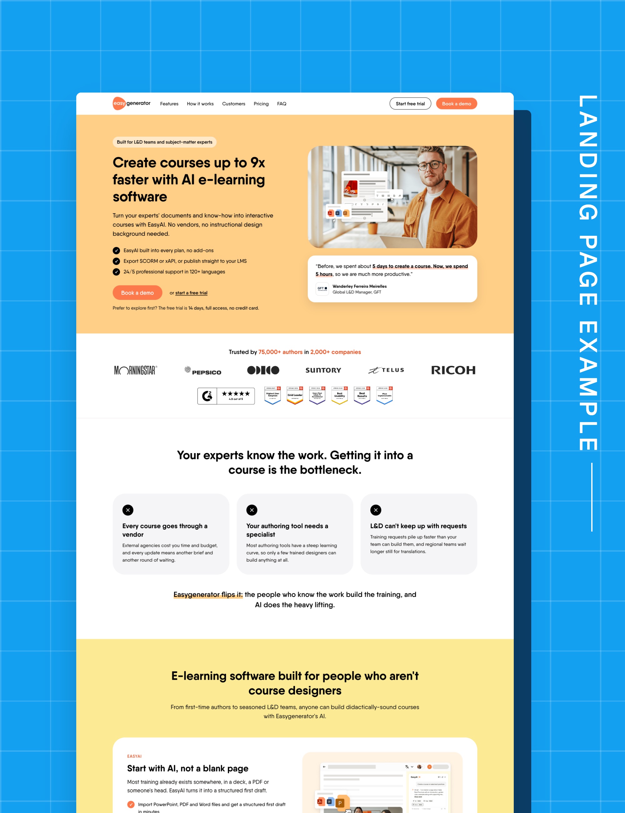
This article walks through the core sections a Google Ads landing page needs (navigation, hero, problem, solution, how it works, proof, pricing, FAQ and close) and what each one should do, with a real page as the example.
The landing page breakdown is based on Easygenerator's e-learning software page, easygenerator.com/en/e-learning-software. It uses the public page only, without their ad or conversion data, so it covers structure and copy, not results.
1Navigation: what the menu should do on a landing page
The menu should help improve consumption on the page and lead to conversion. Keeping it focused, with anchor links to the page's sections, helps visitors coming from search find the answers to their questions. External links distract them to other pages, away from the landing page's message and the conversion action.
Original
The page uses the full website menu, plus a webinar banner, a company bar and Login. Book a demo is visible straight away, which is good. But Pricing and Features only lead to other pages, and the webinar, Careers and Login have nothing to do with why the visitor clicked the ad. Every one of those links pulls the visitor away from the offer they came for.
Suggested
In the suggested version, the menu only jumps to sections on the page (Features, How it works, Customers, Pricing, FAQ), so the visitor finds the price or the proof without leaving. The banner, company links and Login are removed, and Book a demo becomes the main button.
2Hero: what the first screen should say
The hero should confirm the visitor is in the right place and give them a reason to keep reading. A headline with the outcome and a number, one main button and proof next to the claim do that in the first screen. A headline that only describes the product, or two buttons of the same weight, leaves the visitor to work out what to do next.
Original
The headline has the keyword people search for, but Create training at scale
only describes what the product does, not the dream outcome the buyer wants to achieve. The first bullet, Create with AI from day one
, repeats the headline instead of adding a new reason to stay. And there's no customer name, logo or rating before the scroll, so nothing builds trust in the first screen.
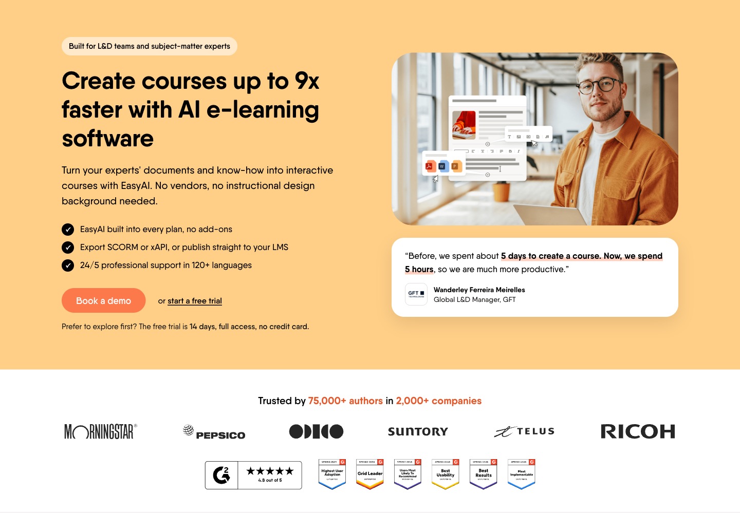
The suggested hero leads with a number Easygenerator already uses on its homepage, Create courses up to 9x faster with AI e-learning software
. The bullets answer what a buyer checks next (AI in every plan, LMS export, support), and Book a demo is the one main button, with the trial as a text link. A GFT quote and a trust bar with customer logos and G2 build trust before the scroll.
3Problem: how to write the problem section
The problem section should show the buyer you understand their situation before you sell anything. Three pains in their own words, each with what it costs them, are enough for them to recognise themselves. A long list of generic pains reads like it's written about someone else.
Original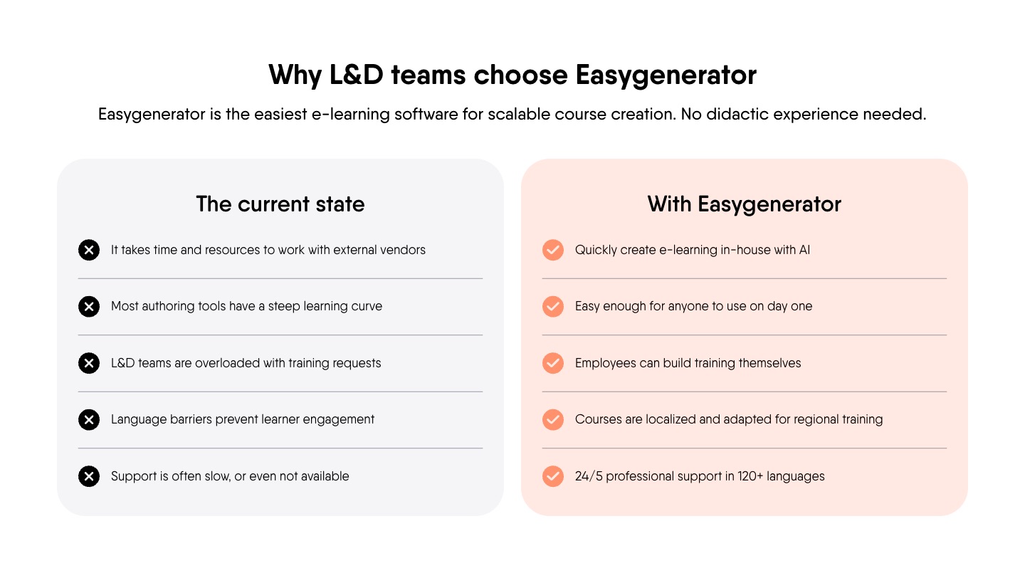
The pains are the right ones, but they're written about L&D teams
in general rather than to the reader, so they describe the situation without making the buyer feel it. None says what the pain costs them. Two of the five rows, language barriers and slow support, are only things the buyer checks later, not pains that make them want to change.
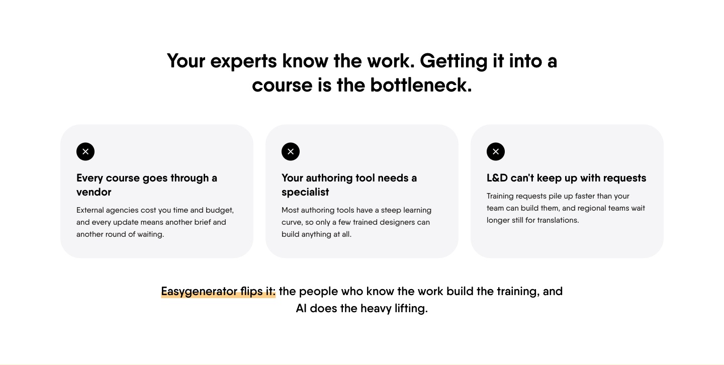
The suggested version speaks to the reader with Your experts know the work. Getting it into a course is the bottleneck.
It keeps three pains, each with its cost (every course goes through a vendor, the authoring tool needs a specialist, L&D can't keep up with requests). Language and support move to the hero and the solution.
4Solution: how to organise the solution section
The solution section should answer the pains above, so the buyer sees their problem solved rather than a list of features. Grouping the product into a few themes, each tied to one named problem, makes it quicker to scan. A feature list organised the way the product team thinks leaves the buyer to do the matching.
Original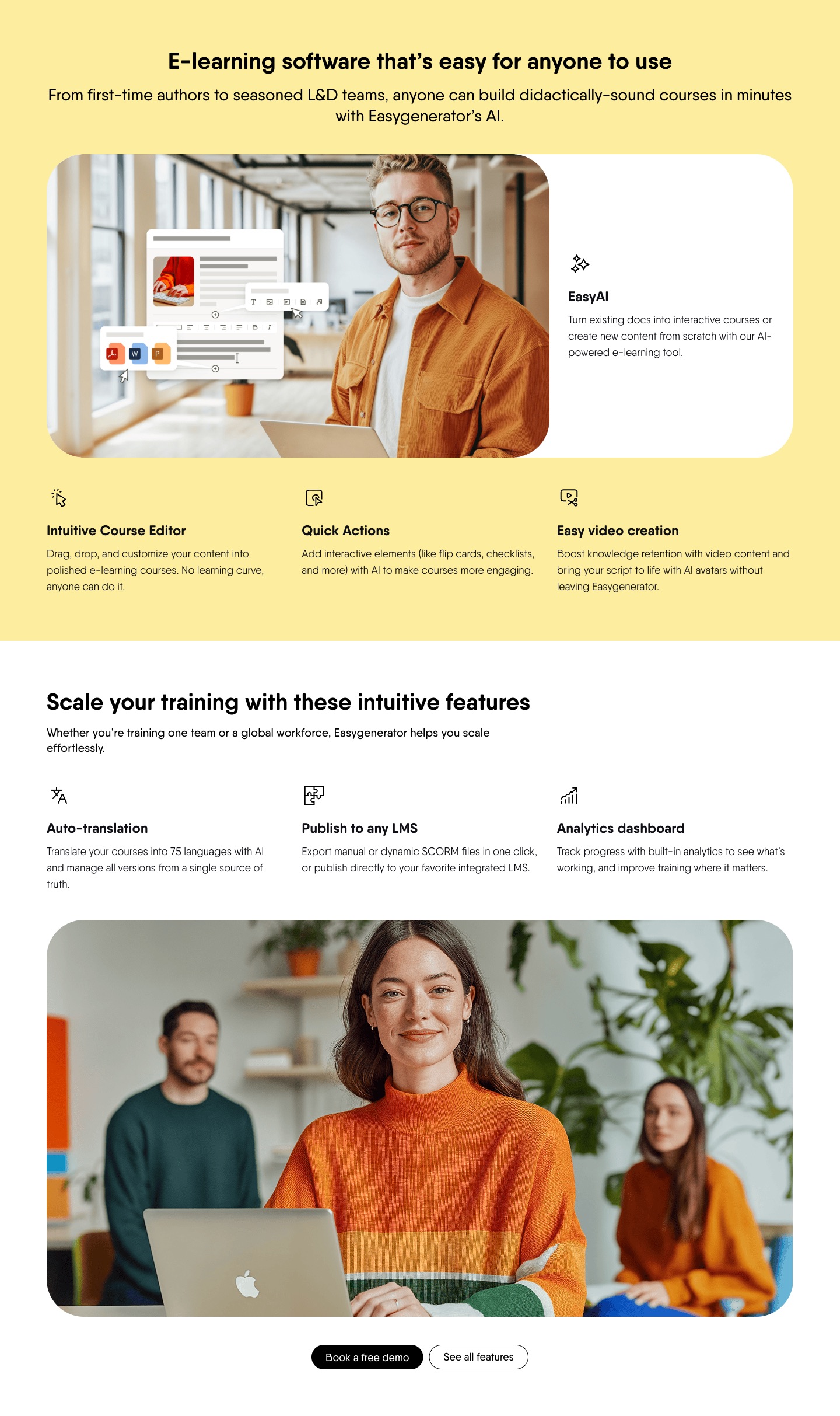
Seven features, each with a clear description, but named only the way the product team sees them. Nothing connects a feature to a pain above, so the buyer has to work out what it solves for them, and a name like Quick Actions
means little to someone new.
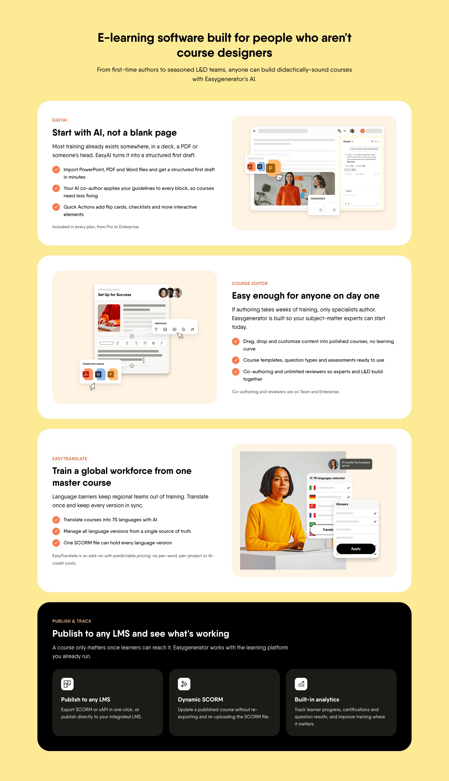
The suggested version groups the features into four themes, each opening with the problem it solves, such as Start with AI, not a blank page
and Publish to any LMS and see what's working
. Each theme ends with the plans that include it.
5How it works: what the steps should show
How it works should explain the process in a few simple steps, so getting started feels easy. Three steps are enough, from the first action to the result the buyer gets. It lowers the perceived effort right before the visitor decides whether to book.
Original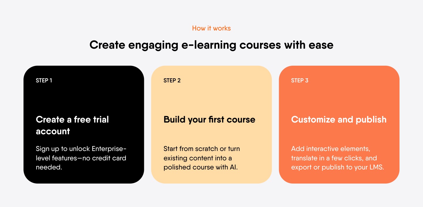
The three steps are clear and easy to follow (Create a free trial account
, Build your first course
, Customize and publish
), so the process already feels simple. The one thing that doesn't fit is step 1, which points to the trial while the hero's main CTA is a demo.
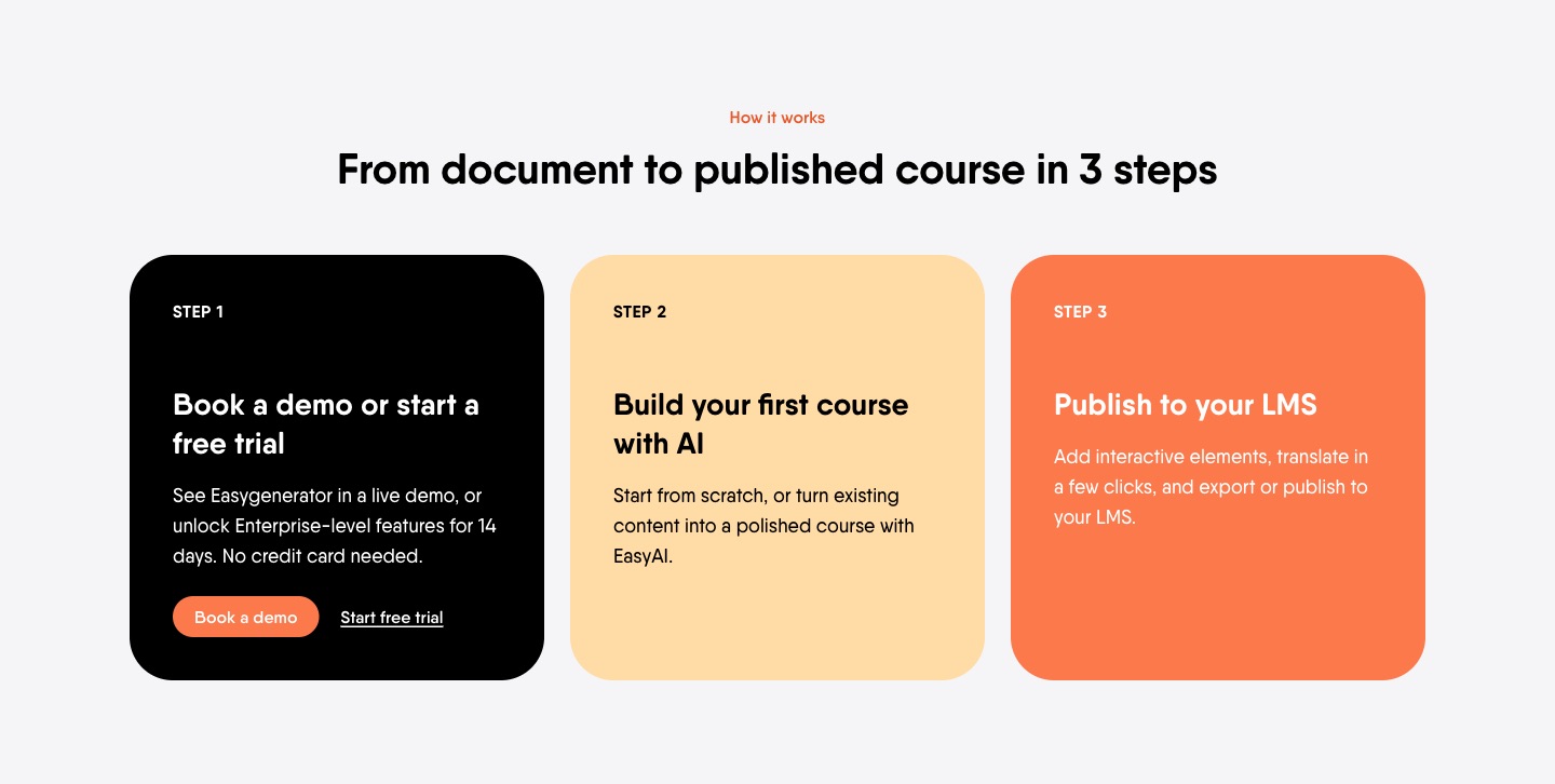
The suggested version keeps the three steps and only changes step 1 to Book a demo or start a free trial
, so it matches the hero's main CTA.
6Proof: what makes customer proof convincing
Proof should back the claims on the page with something the buyer can check. Names, job titles, companies and numbers make it credible, and an ask right after turns that trust into action. Anonymous reviews carry little weight with a B2B buyer who has to justify the decision internally.
Original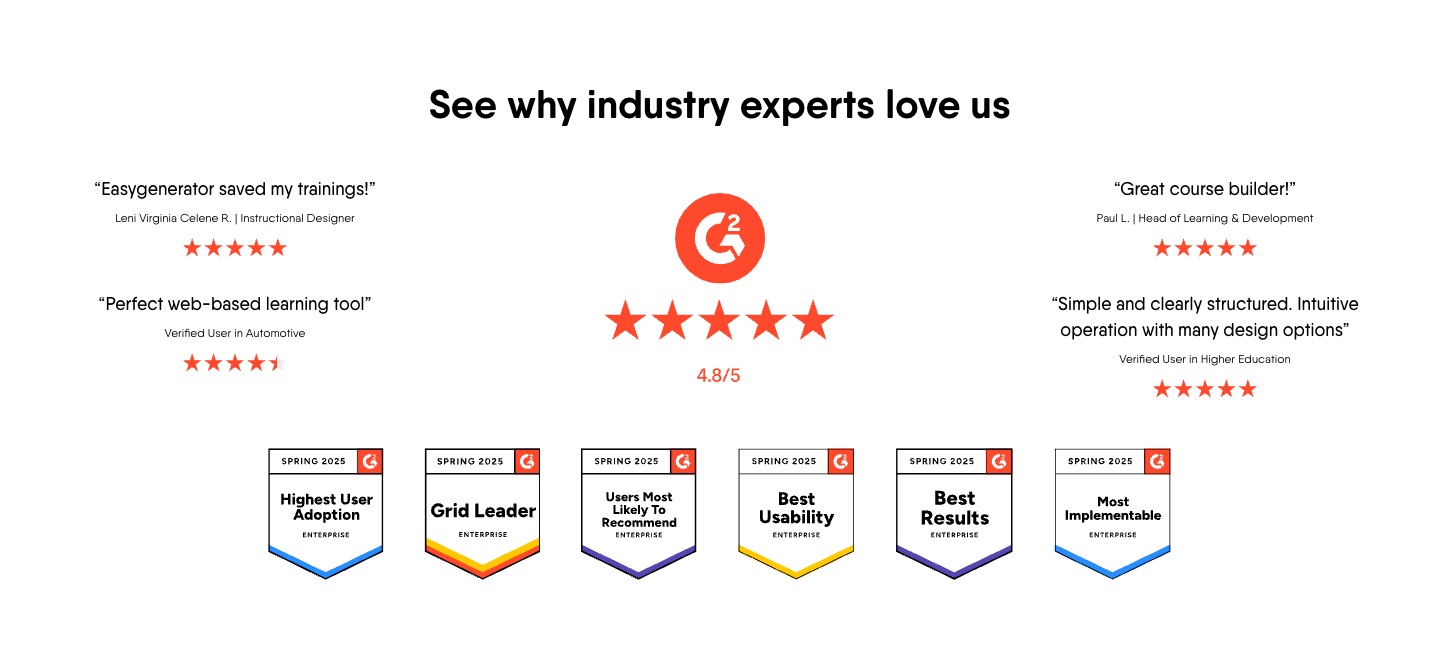
The G2 rating and badges help. But the reviews are only one-liners like Great course builder!
from Verified User in Automotive
, with no company and no result, so they don't show an outcome a buyer could check or repeat internally.
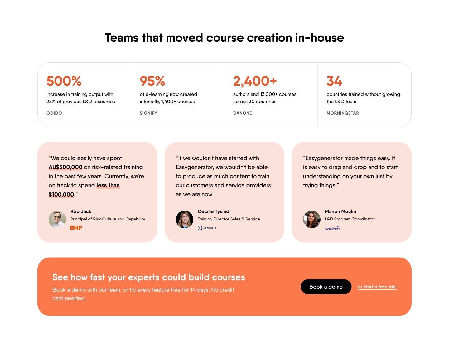
The suggested version uses results from Easygenerator's own customer stories (Odido, Signify, Danone, Morningstar), plus quotes with name, title and company, one with a number (BHP, AU$500,000 down to under $100,000). A demo ask follows right after.
7Pricing: whether a landing page should show the price
Pricing on a demo page should help people qualify themselves before the call. Plans and starting prices set expectations, so the people who book already know the price range. A full comparison table pulls the conversation toward features and can stay on the pricing page.
OriginalThere's no pricing section, only a link in the site menu that takes the visitor off the page. Anyone checking whether it fits their budget has to leave the page to find out.
Suggested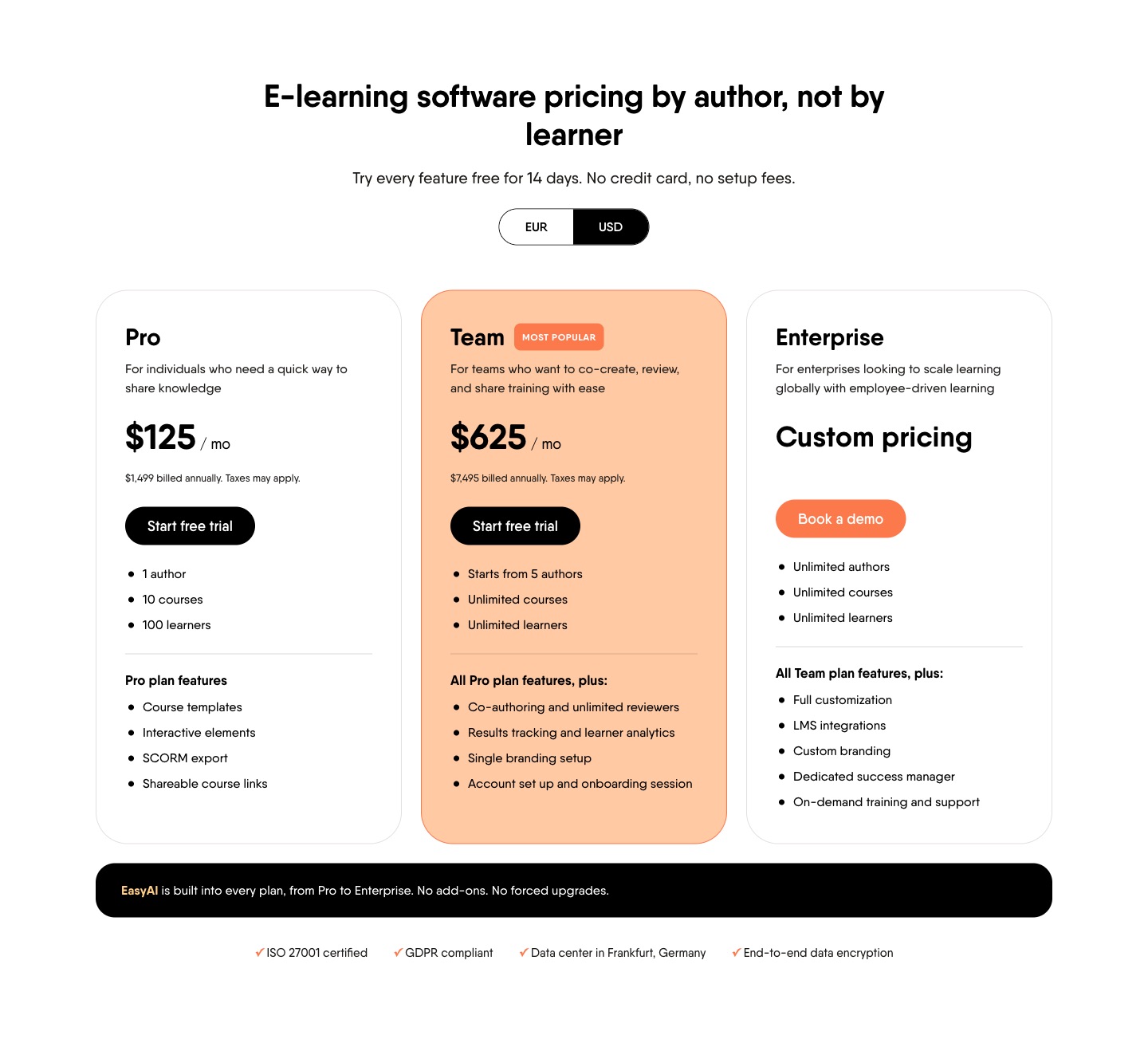
The suggested version adds the three plans with prices and Try every feature free for 14 days. No credit card, no setup fees.
Someone who sees the Team plan starts at $7,495 a year and still books already knows the price range.
8FAQ: which questions the page should answer
The FAQ should handle the objections that stop someone from booking. Answering them on the page, including the catch people rarely ask about out loud, removes the last reasons to wait. Questions that repeat the sections above only add length.
OriginalThere's no FAQ, so the objections that stop someone from booking, like LMS fit or what price per author means, stay unanswered on the page.
Suggested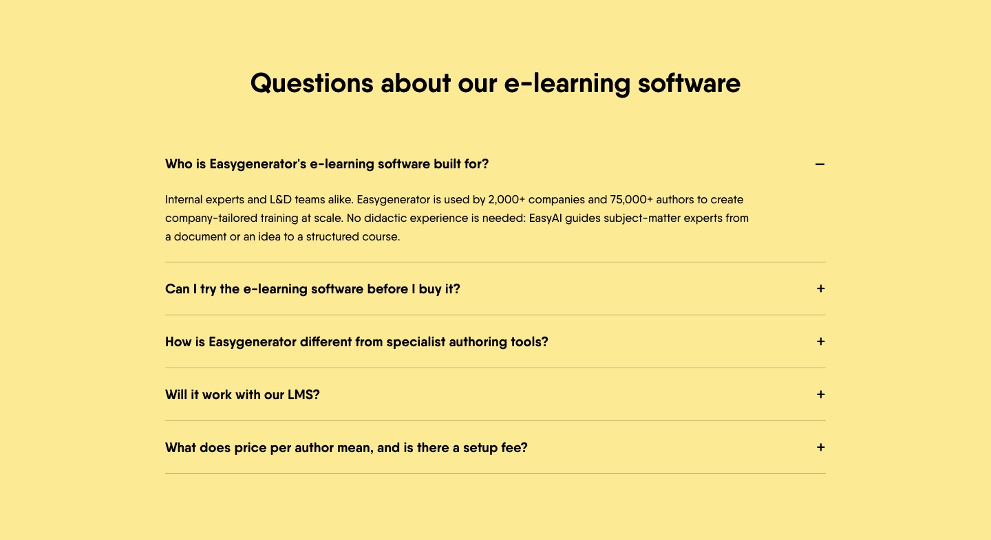
The suggested version adds five questions, including LMS fit, trying before buying and the catch (what price per author means, and whether there's a setup fee).
9Close and booking: how the page should end
The end of the page should give the visitor who read everything a clear last step. A short recap and the same main button do that. When they click, the booking should open on the page, so they stay on the page that convinced them.
The end of the page
Original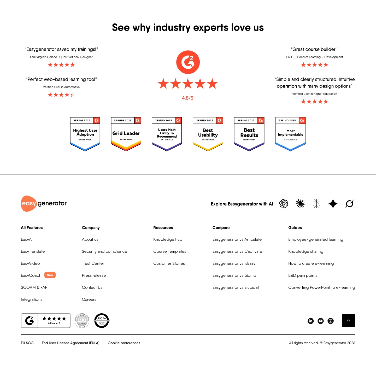
The page ends on the reviews and goes straight into the site footer. The visitor who read everything and is ready to act gets no last CTA, only links to other pages.
Suggested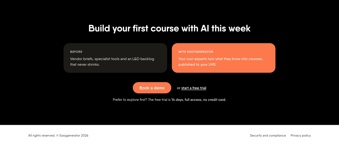
The suggested version adds a closing block that recaps the before and after, with Book a demo once more.
What happens when someone clicks Book a demo
Original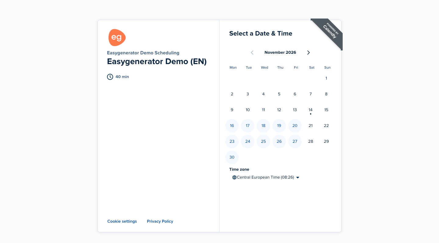
Book a demo opens Calendly in a new tab. The calendar is simple and the UTM tags travel with the booking, but the visitor is taken away from the page that convinced them.
Suggested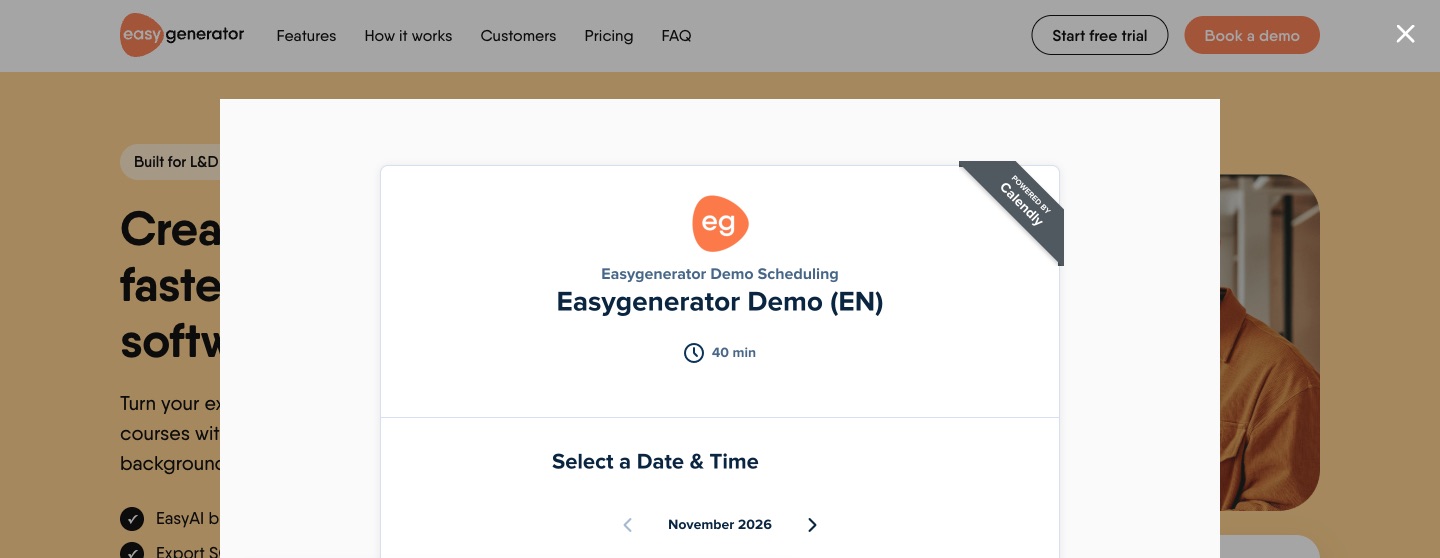
In the suggested version, the same calendar opens as a popup on top of the page, and closing it puts the visitor back where they were. The UTM tags pass the same way, and a booking fires a calendly_demo_booked
event for conversion tracking.
Landing page example: full preview
The full mockup, with every suggested section in place. Open the full page in a new tab.
 Open the full page
Google Ads landing page 101: summary
Here's an overview of the landing page sections, with the key recommendation for each and why. Use it to check whether your own landing page covers the essentials.
| Section | Recommendation | Reason |
|---|---|---|
| Navigation | Anchor links to the page's sections, the main CTA as the primary button, no Login or site menu | External links distract visitors from the message and the conversion action |
| Hero | A headline with the outcome, a description that removes the main objections, one main button, and proof or logos before the scroll | The first screen decides whether the visitor stays and knows what to do next |
| Problem | 3 pains in the buyer's words, each with its cost, and no selling yet | The buyer needs to recognise their own situation before they listen to a solution |
| Solution | 3-4 themes, each solving one named problem, with a product image each | Buyers scan for their problem, not for feature names |
| How it works | 3 simple steps, from getting started to the result | Shows the process is easy and lowers the effort of getting started |
| Proof | Name, title and company on every quote, numbers in the results, and an ask right after | A B2B buyer needs proof they can check and repeat internally |
| Pricing | Plans and starting prices, without the full comparison table | People qualify themselves before the call and book knowing the price range |
| FAQ | 4-5 questions that stop people from booking, including the catch | Every objection answered on the page is one less reason to wait |
| Close and booking | A short recap with the main button, and a calendar that opens on the page | The visitor who read everything gets a clear last step and stays on the page that convinced them |
FAQ
What should a B2B SaaS Google Ads landing page include?
A menu that keeps people on the page, a hero with the outcome and one main button, the problem in the buyer's words, the solution by problem, 3 steps, named proof with numbers, pricing, an FAQ and a closing CTA. Those are the 9 sections above.
Should a Google Ads landing page show pricing?
I'd show plans and starting prices. It qualifies people before the call. Skip the full comparison table.
Free trial or demo as the main button?
On a demo-led page, make the demo the main button and keep the trial as a text link for people who want to explore first.
Should a paid landing page have a full site menu?
No. Keep the logo and links that jump within the page. Every other link takes a paid visitor away from the main CTA.
Does this mean the page would convert better?
I can't say. This is based on the public page, without their ad or conversion data. It's how I'd structure it, and the next step would be to test it.

I take over Google Ads for B2B SaaS companies and build the landing pages behind them. 8+ years across agency and in-house, with $8M+ in ad spend managed across 25+ SaaS brands.